Overview
Boys Cry is a conceptual brand project exploring masculinity, emotional expression, and the importance of creating space for vulnerability. The project challenges traditional expectations of masculinity through a bold visual identity that communicates confidence while encouraging a more open conversation around emotions.
Deliverables
Brand Guidelines
Logo
Colors
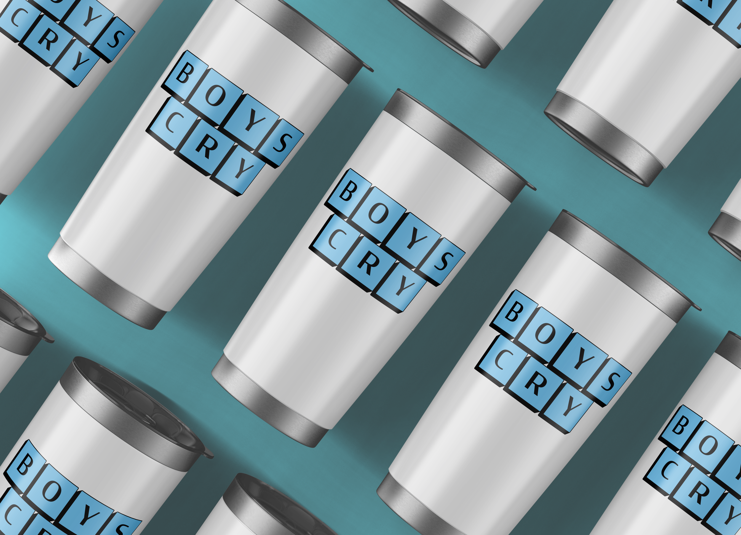
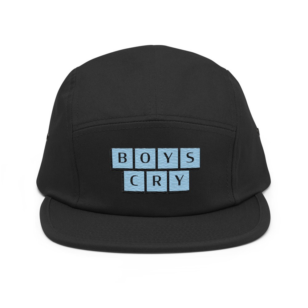
Wearables
The Challenge
Develop a recognizable brand identity that challenges conventional perceptions of masculinity while remaining visually bold, memorable, and engaging. The design needed to balance a strong, confident aesthetic with a message that encourages emotional openness and challenges the stigma surrounding vulnerability.
Creative Approach
The visual direction combines oversized typography, geometric composition, and a high-contrast color palette to create an identity that feels direct, expressive, and contemporary. Individual letterforms are presented in structured blocks, giving the typography a sense of weight and presence while allowing the composition to feel playful and distinctive.
The light blue palette contrasts with the black typography and dimensional shadows, creating a visual system that stands out while reinforcing the project's central message: vulnerability and strength can coexist.
Design Execution
The identity centers on a bold typographic treatment of the Boys Cry name. Repeated letter blocks establish a recognizable visual signature, while the strong contrast, spacing, and dimensional effects create depth and visual impact.
The resulting design translates a socially relevant concept into a memorable visual identity, using typography and composition as the primary tools for communication.